Visualizing extreme events with ggplot2
5 min
When working with time series, sometimes, it is desired to highlight some events with some particular pattern.
For example, highlight periods of time where the variable on interest exceed certain threshold or conversely. With this in mind, I extended an stat of ggplot2 to allow easy visualization of those events. A will show how to use this stat using a simulated time series with exponential correlation function.
Required packages
I will use the tidyverse collection of packages, lubridate and my package day2day. If you want to install day2day, you can get it using the command devtools::install_github("erickchacon/day2day").
library(tidyverse)## Loading tidyverse: ggplot2
## Loading tidyverse: tibble
## Loading tidyverse: tidyr
## Loading tidyverse: readr
## Loading tidyverse: purrr
## Loading tidyverse: dplyr## Conflicts with tidy packages ----------------------------------------------## filter(): dplyr, stats
## lag(): dplyr, statslibrary(lubridate)##
## Attaching package: 'lubridate'## The following object is masked from 'package:base':
##
## datelibrary(day2day)Simulating correlated time series
I use a exponential correlation function \(c(d) = \exp(-d/\phi)\) to represent the correlation between two random variables with temporal distance of \(d\). Then, in order to simulate \(Y \sim N(\mu, \mathbf{\Sigma})\), I use the Cholesky decomposition \(\mathbf{\Sigma} = \mathbf{L}\mathbf{L}^\intercal\). Defining \(Z \sim N(0, I)\), it can be shown that \(\mathbf{L}Z \sim N(\mu, \mathbf{L}U = \Sigma)\). Hence, I just have to simulate \(Z\), rnorm(n), and compute \(\mathbf{L}Z\).
n <- 300
time <- seq(1, n, 3)
temporal_dist <- as.matrix(dist(time))
cov_matrix <- exp(-temporal_dist/7)
upper_chol <- chol(cov_matrix)
set.seed(1)
precipitation <- t(upper_chol) %*% rnorm(length(time))
time <- ymd("05-01-01") + weeks(time)
data <- data.frame(time, precipitation)
Then, the resulting data frame contains the time and the standardized precipitation under analysis as shown below. Note that most of the values are between -2 and 2.
ggplot(data, aes(time, precipitation)) + geom_line()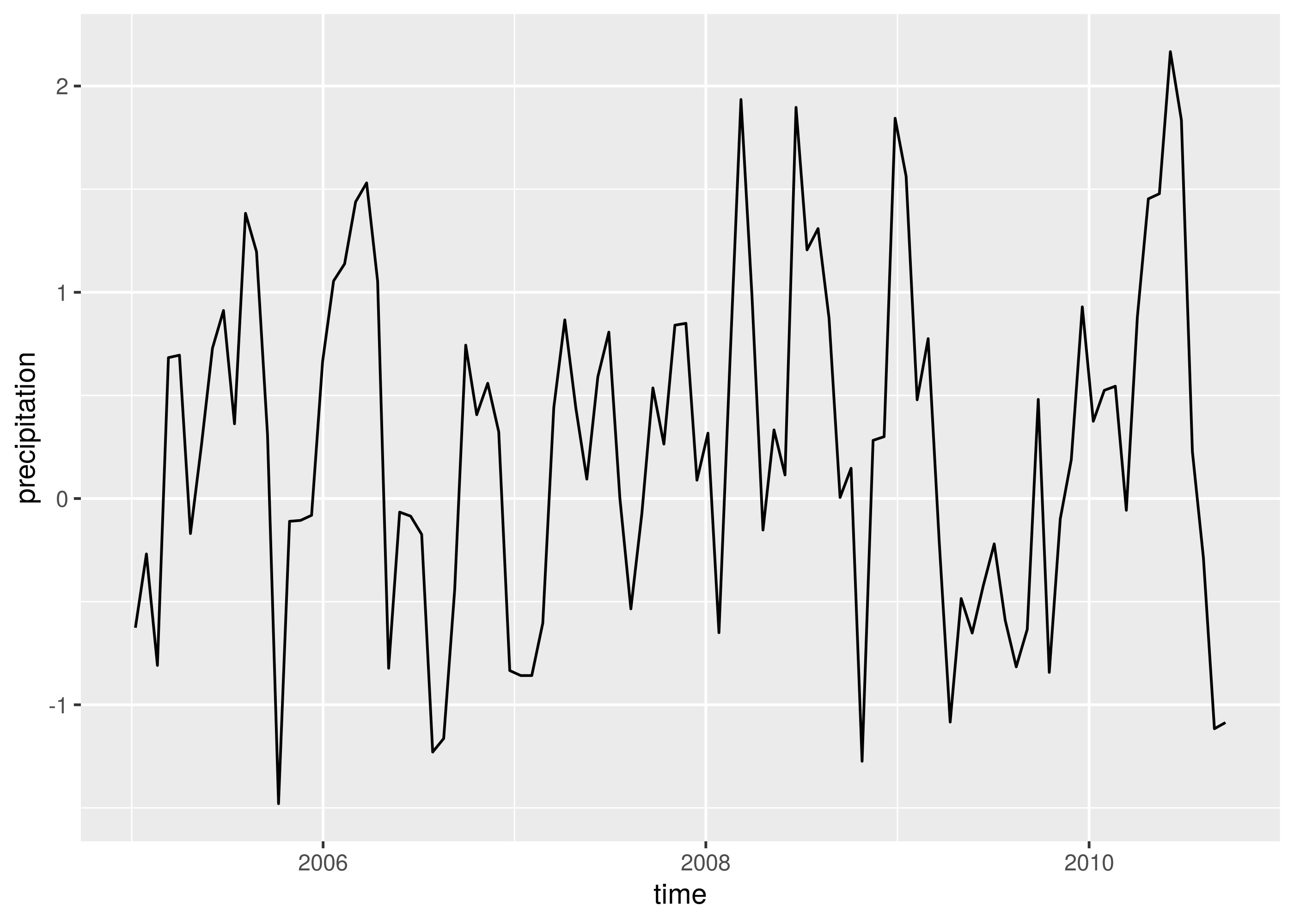
Visualizing positive and negative events
To start, I would like to highlight the difference between events that are constantly positive or negative. So, I made a try using geom_area.
ggplot(data, aes(time, precipitation)) +
  geom_line() +
  geom_point(color = 2, alpha = 0.3) +
  geom_area(alpha = 0.3)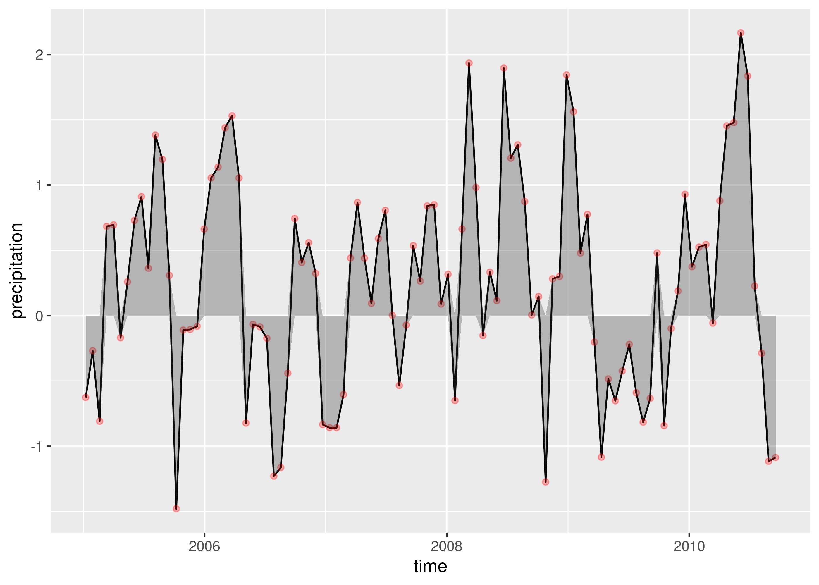
It makes the work, but the quality of the geom_area when the series change from positive to negative, or conversely, is not good. You can see that there is a difference between the geom_line and geom_area around these transitions. So, I created a stat_events that make the same thing as geom_area, but with better quality. Look in the next image how the lines and areas match perfectly.You can see that code to create stat_events in my day2day package.
ggplot(data, aes(time, precipitation)) +
  geom_line() +
  geom_point(color = 2, alpha = 0.3) +
  stat_events(alpha = 0.3)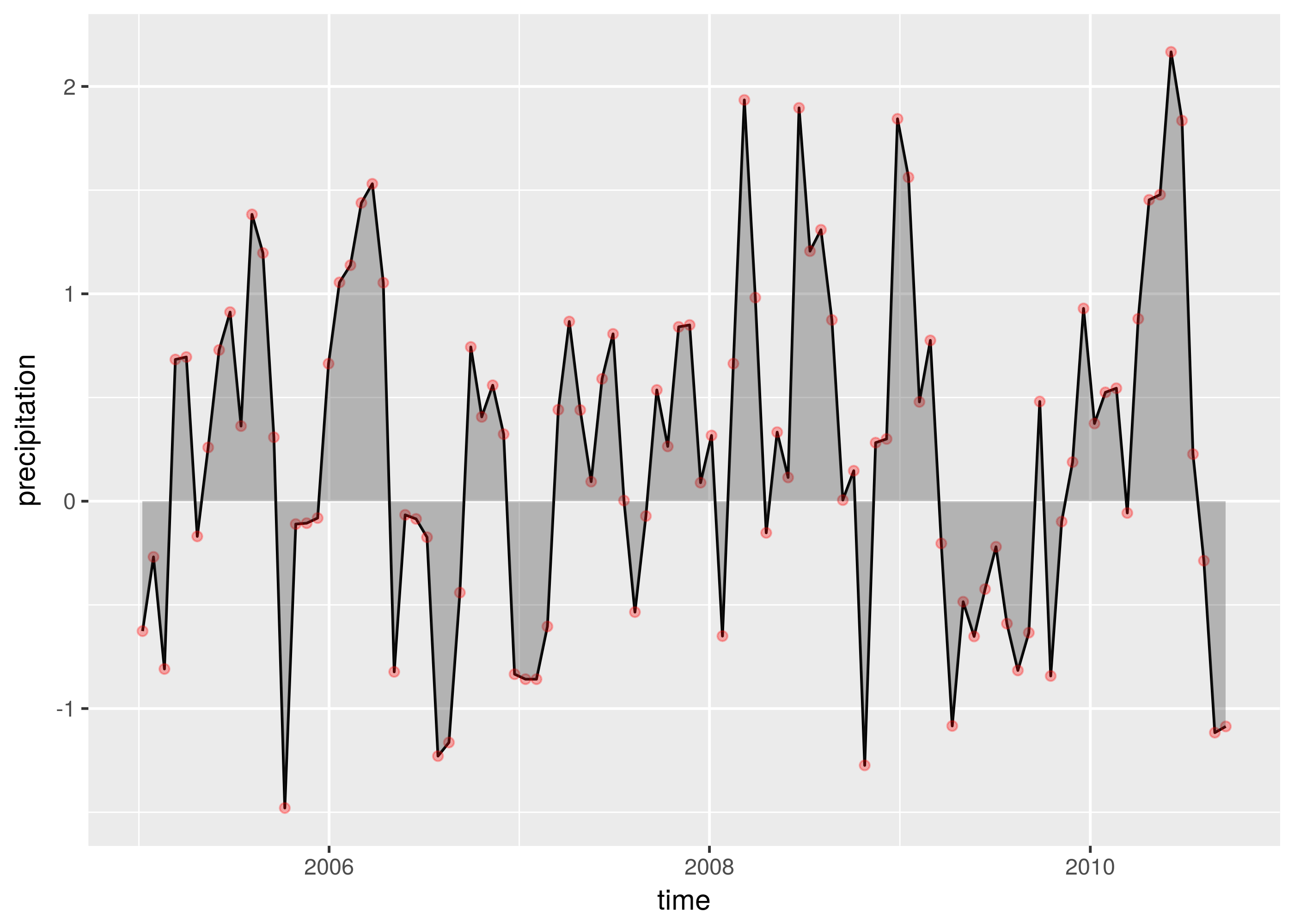
The geometry area only allow you to make a ribbon with a reference point of zero. However, maybe, you would like to differentiate two events using another reference point (e.g. \(-0.5\) or \(0.5\)). This is allow in stat_events by defining the threshold of interest. In the next image, I have used threshold = 0.5.
ggplot(data, aes(time, precipitation)) +
  geom_line() +
  geom_point(color = 2, alpha = 0.3) +
  stat_events(threshold = 0.5, alpha = 0.3)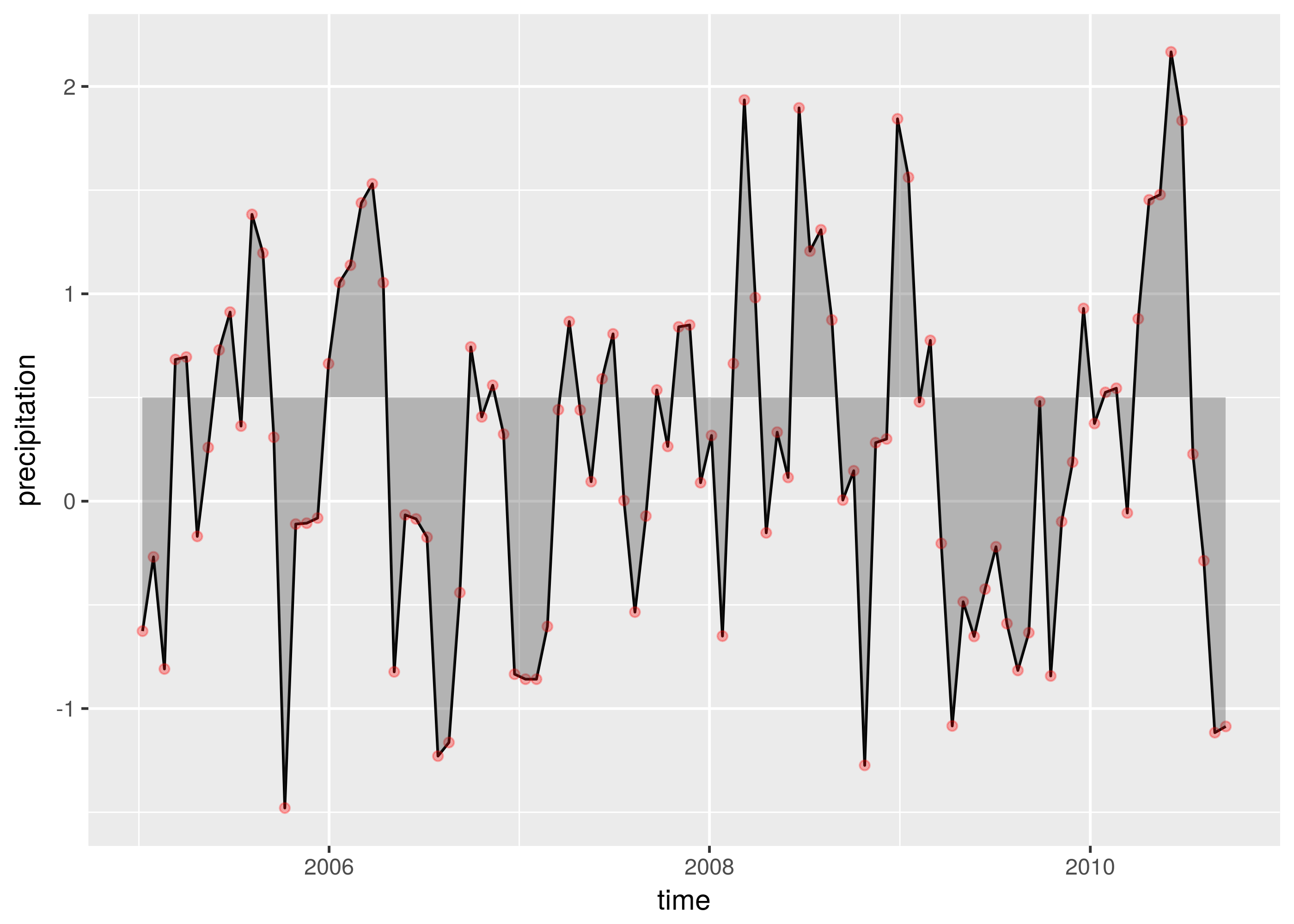
Differentiating events
Now it comes the fun part, the main reason I created this stat is because I wanted to differentiate two different events by coloring them and probably with a name for the legend. My first thought to highlight particular events (e.g. only positives) was using subset on geom_area.
ggplot(data, aes(time, precipitation)) +
  geom_line() +
  geom_area(data = subset(data, precipitation > 0), alpha = 0.3)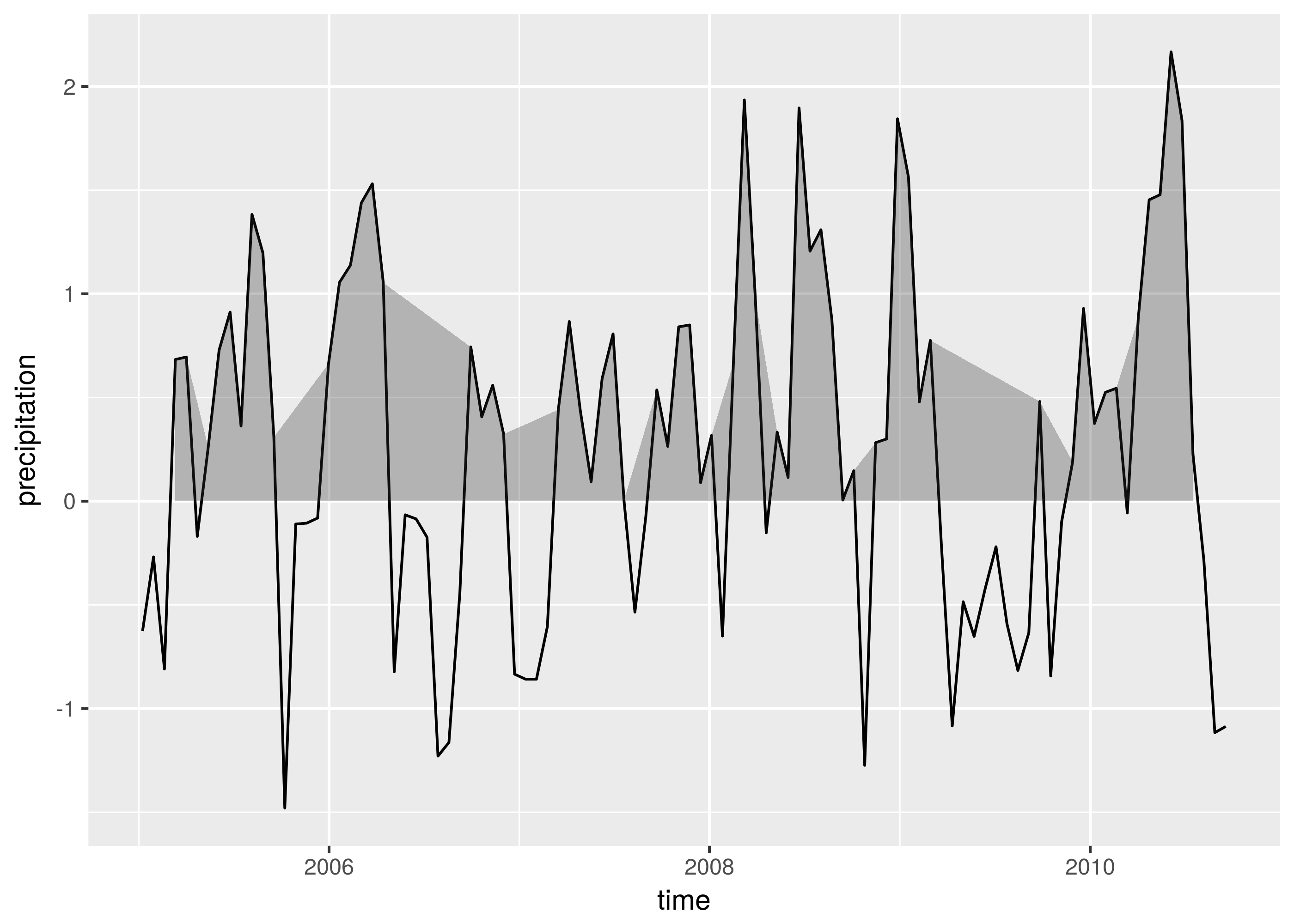
It did not give me good results, because it just jump from one positive event to the next positive event, this jump make the polygons look different from the original time series. For this reason, I added the event aesthetics to stat_events such as it indicates the event of interest. It should be numeric variable taking \(1\) (event), \(0\) (no event) and NA. With this argument, we can easily identify and draw events exceeding or not certain threshold. Let’s assume that flood events are detected when the standardized precipitation is greater than \(>0.5\) and droughts when it is lower than \(<-0.5\). They can be highlighted as follows.
ggplot(data, aes(time, precipitation)) +
  geom_line() +
  stat_events(aes(event = I(1 * (precipitation > 0.5)), fill = "flood"),
              threshold = 0.5, alpha = 0.3) +
  stat_events(aes(event = I(1 * (precipitation < -0.5)), fill = "drought"),
              threshold = - 0.5, alpha = 0.3)
## Warning: Ignoring unknown aesthetics: event
## Warning: Ignoring unknown aesthetics: event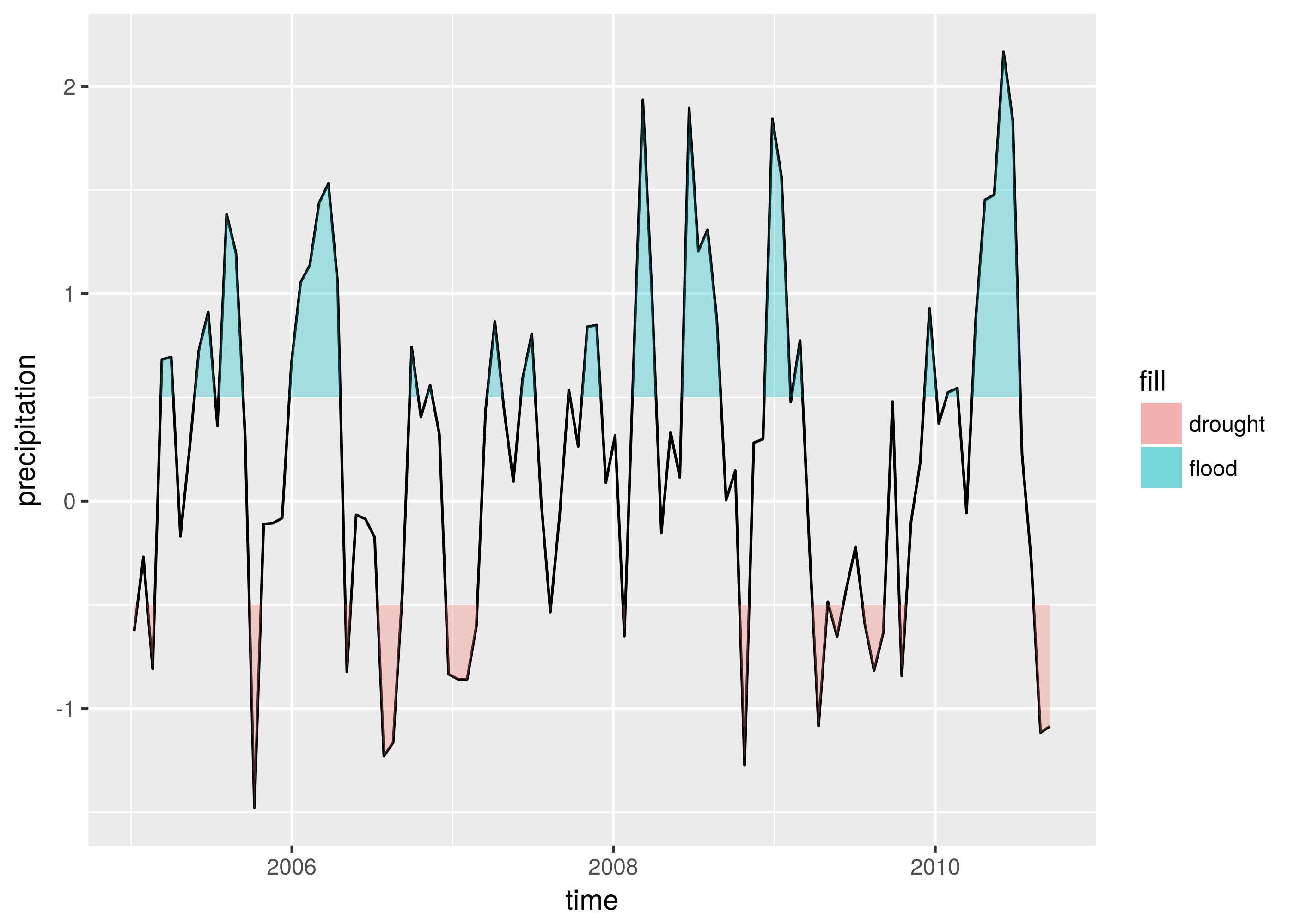
Highlighting floods and droughts
McKee defined a drought as a period of time where the standardized precipitation index (SPI) is continuously negative falling down than \(-1\) at least one time. Based on this definition, I created a function find_flood_drought to detect extreme events using the SPI. You can view the code here, Then a visualization of extreme events can be done using find_flood_drought and stat_events as follows. Note that the event is used as same as before, indicating with a value equals to \(1\) that we want to highlight that corresponding value of the precipitation.
data <- data %>% mutate(
  extremes = find_flood_drought(precipitation),
  floods = 1 * (extremes == "flood"),
  droughts = 1 * (extremes == "drought"))

ggplot(data, aes(time, precipitation)) +
  geom_line() +
  stat_events(aes(event = floods, fill = "flood"), alpha = 0.3) +
  stat_events(aes(event = droughts, fill = "drought"), alpha = 0.3)
## Warning: Ignoring unknown aesthetics: event
## Warning: Ignoring unknown aesthetics: event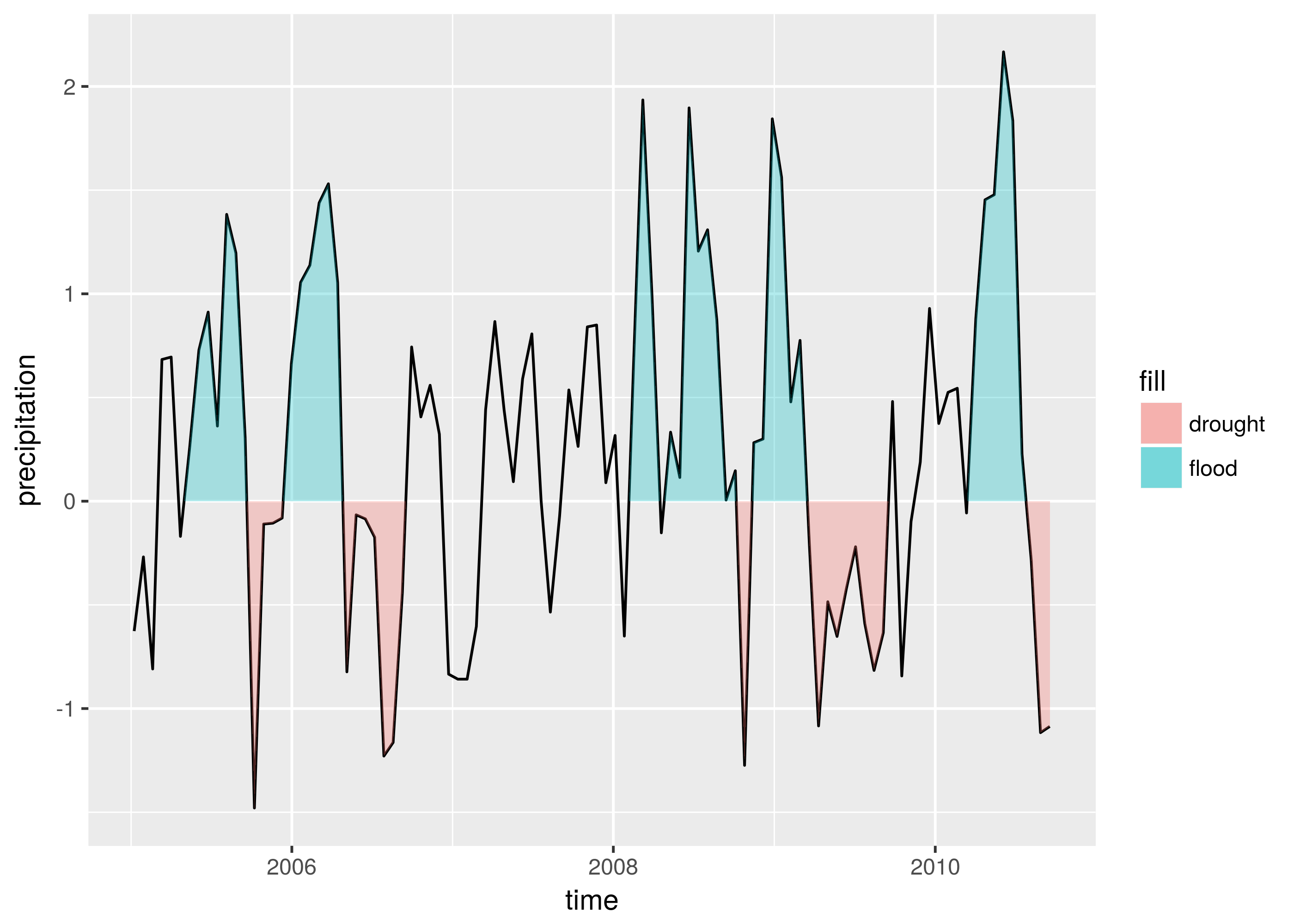
I hope you have enjoyed this post about visualizing events in a time series and if you are asking yourself how I created the stat_events functions, take a view on this tutorial about extending ggplot2.