Standardized daily temperature at Canadian stations
Source:vignettes/articles/vg12-temp-canada.Rmd
vg12-temp-canada.RmdIn this vignette, we use the sfclust package to cluster
Canadian weather stations based on their standardized daily temperatures
averaged over the period 1960–1994.
Load packages and data
We use the polygonal shapes of Canadian provinces from the
rnaturalearth package and the CanadianWeather
dataset from the fda package, which is commonly used in
functional data analysis. This dataset is a list containing daily
temperature data per station, along with metadata such as station
coordinates.
#> [1] "dailyAv"       "place"         "province"      "coordinates"
#> [5] "region"        "monthlyTemp"   "monthlyPrecip" "geogindex"
Prepare data
Create stars data
First, we convert the station coordinates to an sf
object and visualize their locations.
stations <- as.data.frame(CanadianWeather$coordinates) |>
  mutate(longitud = - `W.longitude`) |>
  rename(latitud = "N.latitude") |>
  select(longitud, latitud) |>
  st_as_sf(coords = c("longitud", "latitud"), crs = st_crs(4326))

ggplot() +
  geom_sf(data = canada) +
  geom_sf(data = stations, size = 2) +
  theme_bw()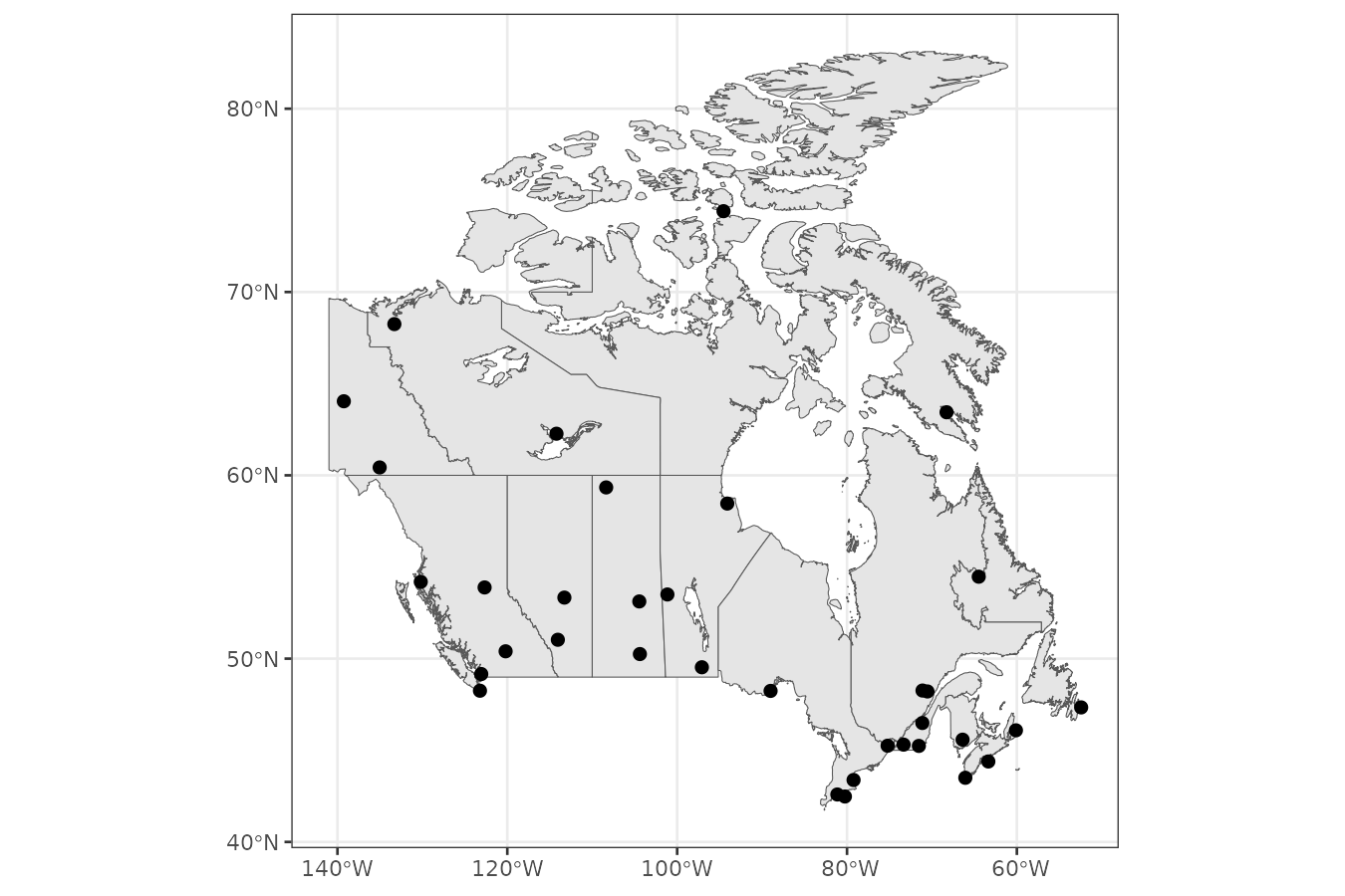
We standardize the temperature per station to focus clustering on the
functional shape of the time series rather than their absolute values.
We then convert the data to a stars object with
geometry and time dimensions, as required by
the function sfclust().
time <- seq(as.Date("1977-01-01"), as.Date("1977-12-31"), by = "1 day")
canweather <- st_as_stars(
    temp = t(CanadianWeather$dailyAv[, , 1]),
    ztemp = t(scale(CanadianWeather$dailyAv[, , 1])),
    dimensions = st_dimensions(geometry = st_geometry(stations), time = time, point = TRUE)
)
canweather
#> stars object with 2 dimensions and 2 attributes
#> attribute(s):
#> Min. 1st Qu. Median Mean 3rd Qu. Max.
#> temp -34.800000 -6.7000000 4.10000000 1.877659e+00 12.600000 22.800000
#> ztemp -1.967879 -0.9821809 0.09676872 -2.067071e-19 0.960108 1.711485
#> dimension(s):
#> from to offset delta refsys point
#> geometry 1 35 NA NA WGS 84 TRUE
#> time 1 365 1977-01-01 1 days Date TRUE
#> values
#> geometry POINT (-52.43 47.34),...,POINT (-94.54 74.41)
#> time NULLExploratory analysis
Let’s explore monthly averages of standardized temperatures. Higher standardized temperatures appear in northern stations during July, while lower values are observed in southern stations in January.
monthdata <- aggregate(canweather, by = "month", FUN = mean)
ggplot() +
  geom_sf(data = canada) +
  geom_stars(aes(fill = ztemp), monthdata, shape = 21, size = 1.3) +
  facet_wrap(~ time) +
  scale_fill_distiller(palette = "RdBu") +
  theme_bw() +
  theme(legend.position = "bottom")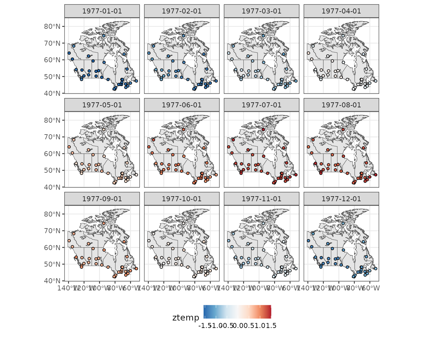
We can also visualize the temperature trends over time for each station. Although the overall shape is similar, there are noticeable differences in the timing of the rise and fall of temperatures across stations.
canweather |>
  st_set_dimensions("geometry", values = 1:nrow(canweather)) |>
  as_tibble() |>
    ggplot() +
    geom_line(aes(time, ztemp, group = geometry, color = factor(geometry)), linewidth = 0.3) +
    theme_bw() +
    theme(legend.position = "none")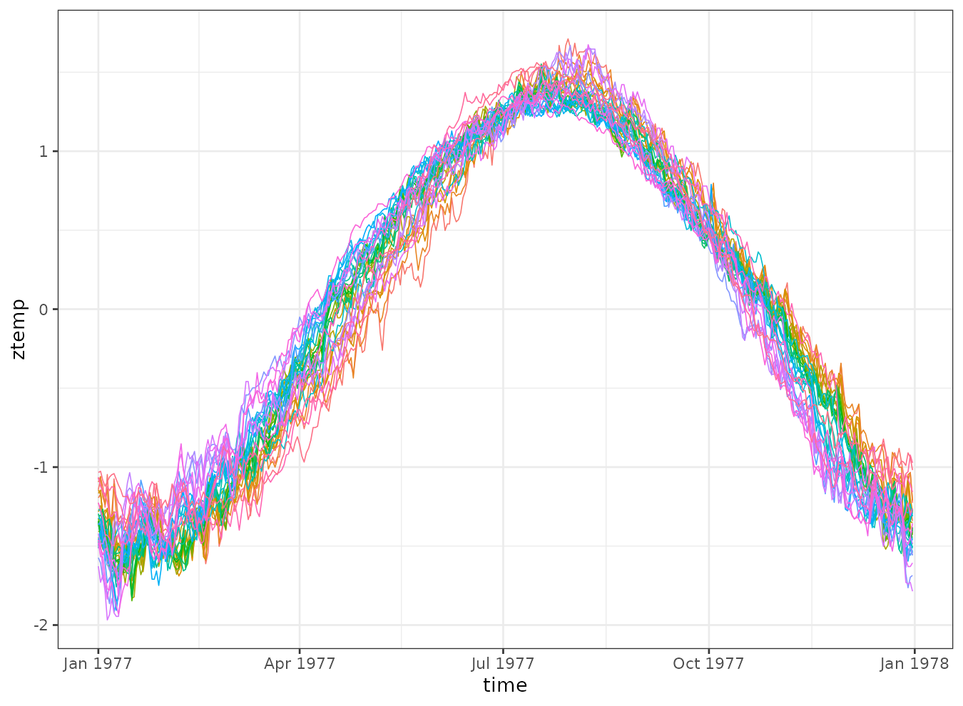
Spatial clustering
Create graph
The sfclust() function assumes a POLYGON
geometry in the stars object to build a spatial adjacency
graph. However, our data uses POINT geometries representing
station locations. To create a spatial graph, we construct a Voronoi
tessellation that generates a polygon for each station.
stations2 <- st_transform(stations, st_crs(3857))

# create boundary
boundary <- st_convex_hull(st_union(stations2)) |>
  st_buffer(units::set_units(1000, "km"))

# create polygons with voronoi
domain <- st_cast(st_voronoi(st_union(stations2), boundary)) |>
  st_intersection(boundary)

# reorganize the polygons to match stations
domain <- domain[as.numeric(st_within(stations2, domain))] |>
  st_transform(st_crs(stations))

ggplot() +
  geom_sf(data = canada) +
  geom_sf(data = domain, color = 4, linewidth = 0.5, fill = NA) +
  geom_sf(data = stations, color = 2) +
  theme_bw()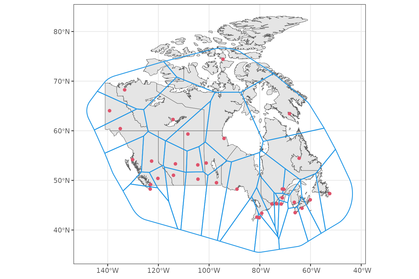
Model fitting
Based on the previously observed trends, we model the standardized temperature as a function of:
- A polynomial trend over
time. - A random walk to capture autocorrelated temporal variation over
idt.
We initialize with 35 clusters—one per polygon—and set a strong
penalty (logpen = -300) to discourage overfitting and large
number of clusters unless the log marginal likelihood improves by at
least 300.
formula <- ztemp ~ poly(time, 2) + f(idt, model = "rw1")
geodata <- genclust(domain, nclust = 35)

set.seed(123)
result <- sfclust(canweather, graphdata = geodata, formula = formula,
    logpen = -300, niter = 4000, burnin = 0, thin = 10, nmessage = 10, nsave = 100,
    control.inla = list(control.vb = list(enable = FALSE)),
    path_save = file.path("canweather-mcmc.rds"))
result
#> Within-cluster formula:
#> ztemp ~ poly(time, 2) + f(idt, model = "rw1")
#>
#> Clustering hyperparameters:
#> log(1-q) birth death change hyper
#> -300.000 0.425 0.425 0.100 0.050
#>
#> Clustering movement counts:
#> births deaths changes hypers
#> 8 29 19 171
#>
#> Log marginal likelihood (sample 400 out of 400): 17541.96Over the course of sampling, 8 cluster additions, 29 merges, and 19 reassignments occurred. The marginal likelihood reached a value of 17,541.96. After thinning, 400 samples were retained.
Results
summary(result, sort = TRUE)#> Summary for clustering sample 400 out of 400
#>
#> Within-cluster formula:
#> ztemp ~ poly(time, 2) + f(idt, model = "rw1")
#>
#> Counts per cluster:
#> 1 2 3 4 5 6 7 8 9 10 11 12 13 14
#> 7 7 4 3 2 2 2 2 1 1 1 1 1 1
#>
#> Log marginal likelihood: 17541.96According to the summary() output, 8 out of 14 clusters
have more than one member. The largest clusters contain 7, 7, and 4
stations, respectively. To assess convergence, we plot the marginal
likelihood trace:
plot(result, which = 3)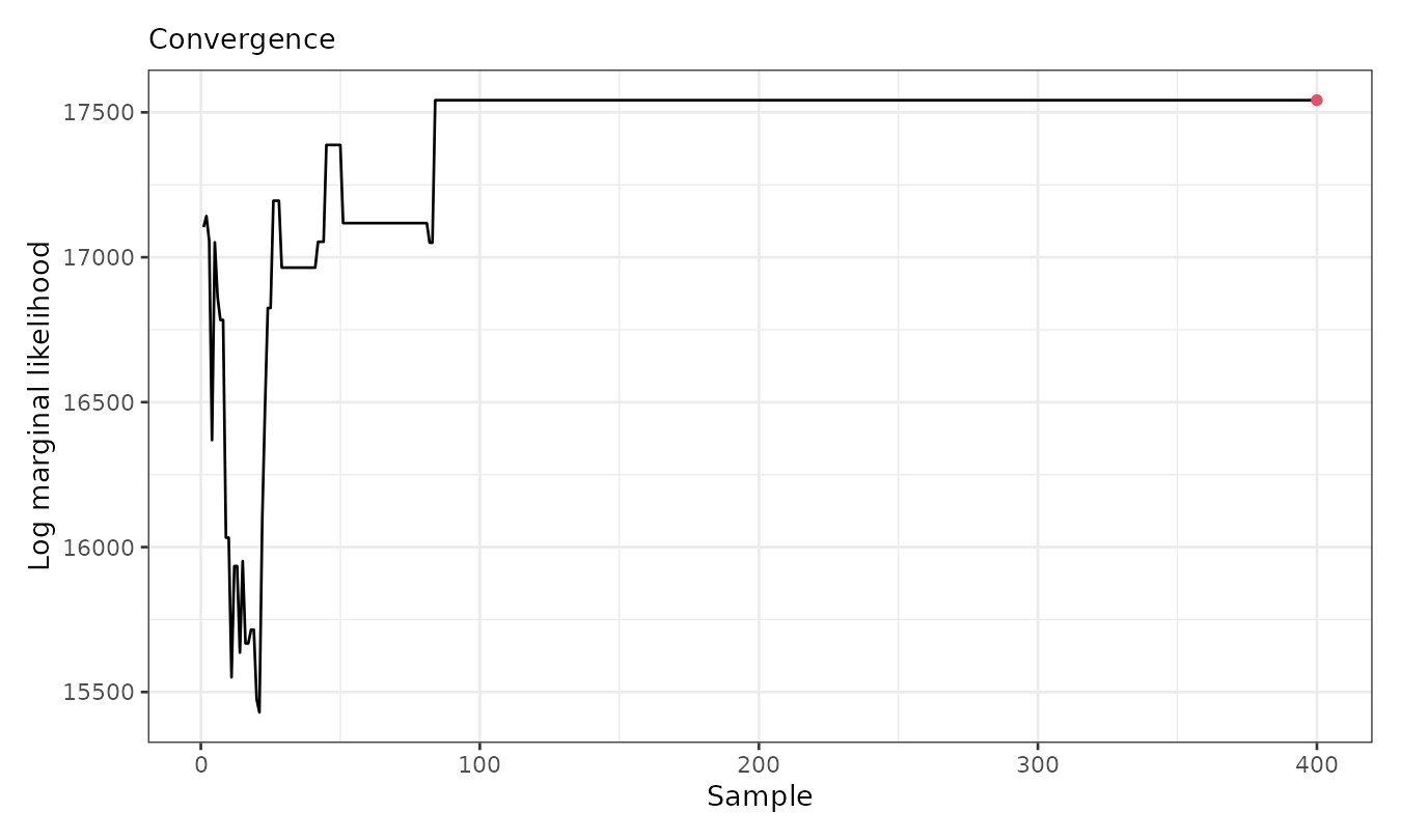
The plot shows that the marginal likelihood stabilizes after the first 100 (thinned) iterations. Below, we visualize the cluster assignments and averaged fitted means:
gg1 <- plot_clusters_map(result, sort = TRUE, legend = TRUE, clusters = 1:8,
    geom_before = geom_sf(data = canada), size = 3, alpha = 0.8)
gg2 <- plot_clusters_fitted(result, sort = TRUE, clusters = 1:8, linewidth = 0.4)
gg1 + gg2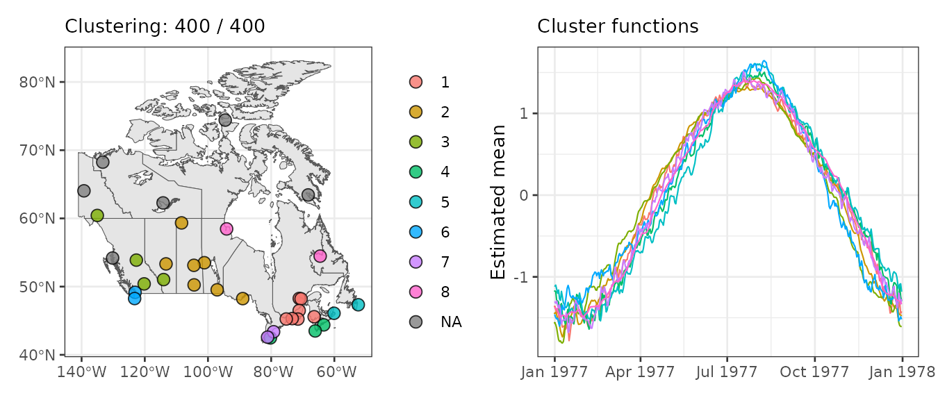
The largest cluster is in southeastern Canada and includes 7 closely located stations. The second-largest is more dispersed, while the third is in the southwest with 4 stations.
Empirical standardised temperature per cluster
We use plot_clusters_series() to visualize the raw
standardized temperature per cluster. The output can be customized using
ggplot2 elements.
plot_clusters_series(result, ztemp) +
  geom_hline(yintercept = 0, linetype = 2) +
  facet_wrap(~ cluster, ncol = 5) +
  scale_x_date(date_breaks = "2 months", date_labels =  "%b") +
  labs(y = "Standardized temperature")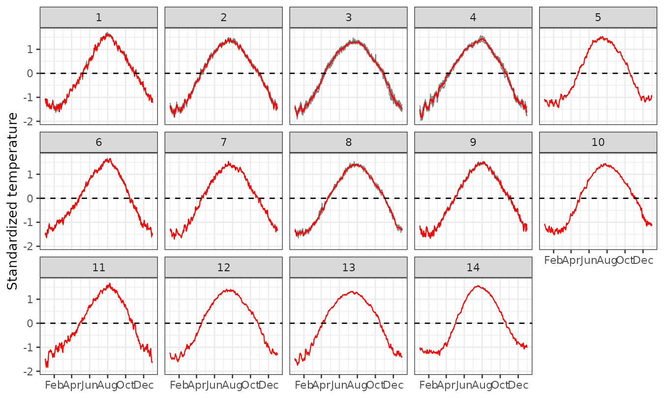
Panels 1–8 show the empirical risk per cluster for those clusters that contain more than one station. The main differences among these clusters lie in the initial shape of the curve, the speed of increase, the shape and timing of the peak, and the behavior during the decay phase. For example, clusters 1 and 2 exhibit a bell-shaped pattern, while others, such as clusters 3 to 6, display a nearly linear increase until reaching a maximum level. Panels 9–14 present the empirical risk per cluster for those that contain only one station. These single-station clusters tend to exhibit more unique shapes, which not only distinguish them from the previous multi-station clusters but also from each other.